Timeline
2022-2023
Company
Dexcom
Role
Collaborators
Increase sensor insertion success rate through the use of short animations
Context: what is Dexcom G7?
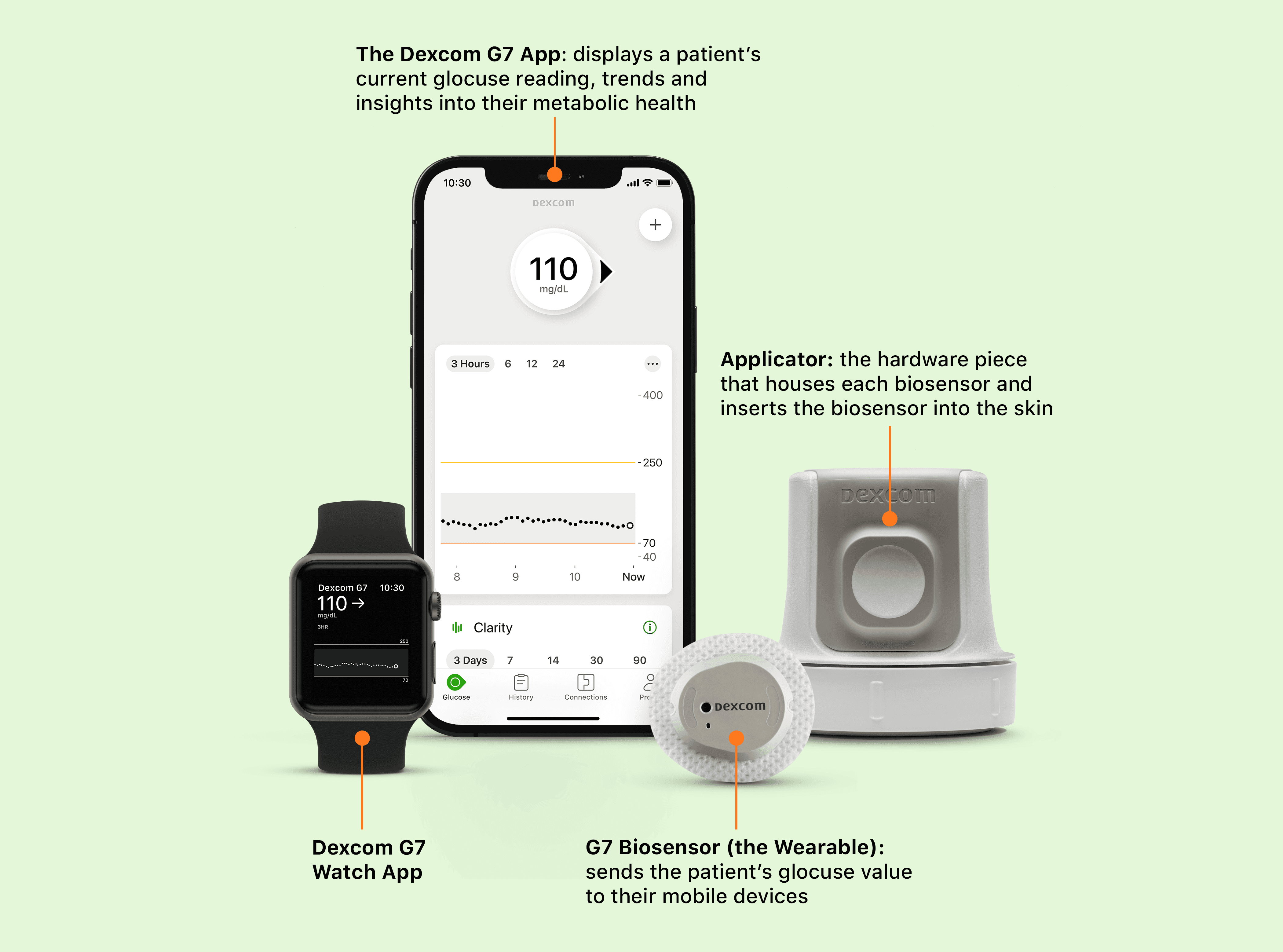
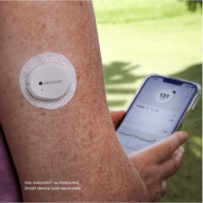
Dexcom is a global company that designs and manufactures continuous glucose monitoring systems for people living with diabetes.
The Dexcom sensor is paired with the Dexcom app, and sends the patient's glucose reading to the app. The patient interacts with the data in real time, which inform them of insulin dosing, and diet and physical activity decisions. The app includes additional features to make their diabetes management easier.
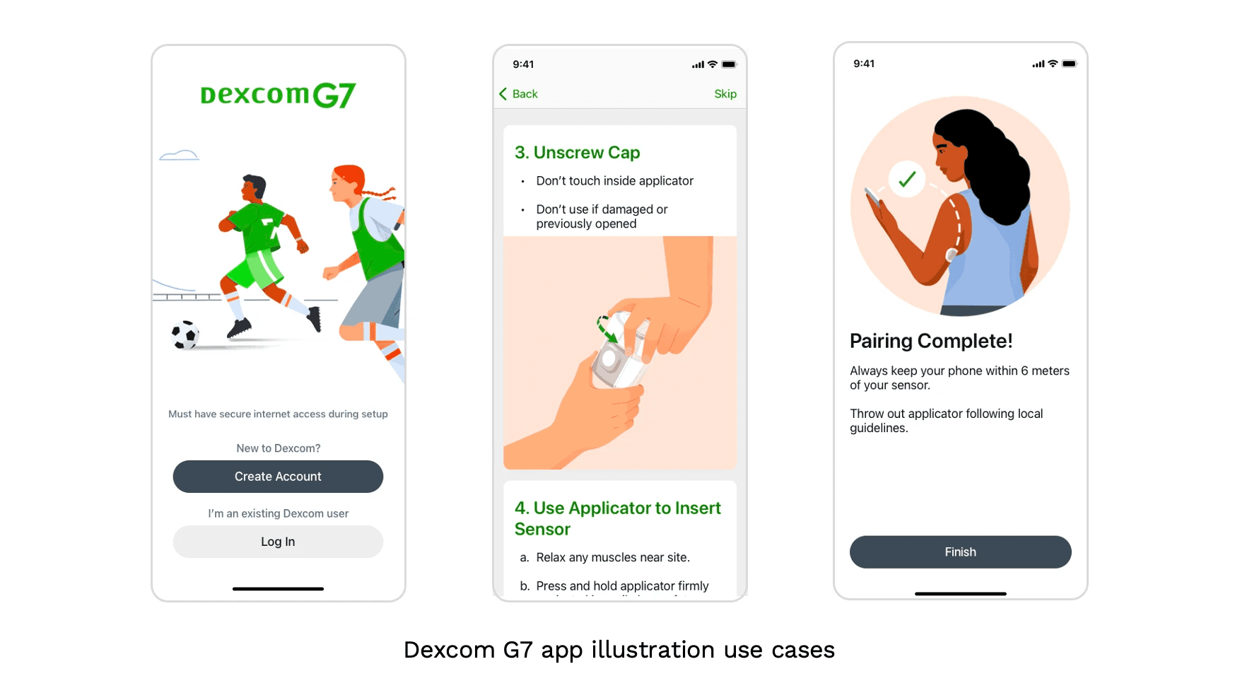
Our in-product illustrations are there to provide guidance, feedback, and reinforcement to at key moments through the user journey.
Background:
Shortly after Dexcom G7 launched in February 2023, a small percentage of first-time users had troubles inserting the new Dexcom G7 sensor following instructional illustrations. Step 4, for example, proved to be a persistent hurdle for many of our users.
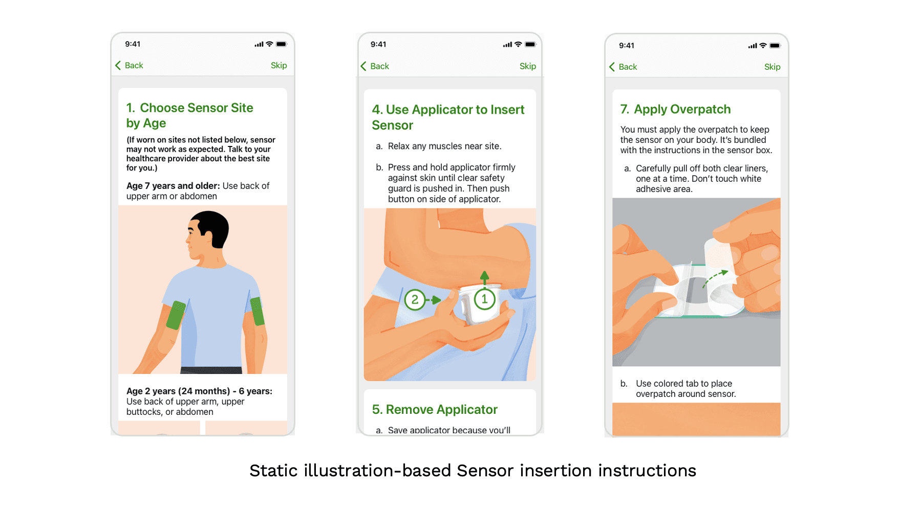
Proposed solution:
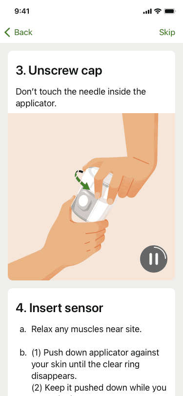
Using animations to replace static illustrations at key steps
Constraints to proposed solution:
Competing priorities
Engineering team preferred static illustrations over Mp4s to keep app size small / not allowed to use Lottie / Rive files due to concerns of security breach (since medical device app)
Difficult to secure buy-in for novel approach
My approach to moving this initiative forward:
The first thing I did was mapping out the existing sensor insertion flow
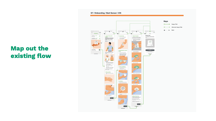
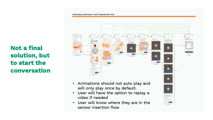
From there, I started with a rough re-imagination of what it could be like to have a flow that provides video instructions on select steps that were challenging for first-time users.
This is not meant to be the final solution at all, but rather to get the product and engineering teams thinking
I showed the design at our product team’s weekly design critique and got some genuinely interested responses and feedback. That’s where I received the green light and resources to explore this further
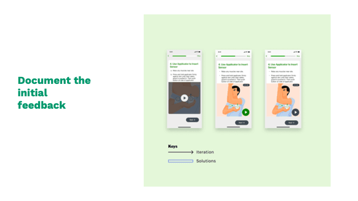
I documented the initial feedback (examples below):
Product team suggested removing the dark overlay so people can see the graphic at first glance
Create a countdown stamp at each animation’s top right corner so users understand these animations are short
After the initial showing at our design crit, UX UI designers, PM, HF joined forces with Product Creative. Arrived at final solution:
Animation implemented at key steps
Autoplay once
Play button shows video progress
Impact:
What would I do differently if I had more time, resources, etc.:
Turn these animations into platform native code to keep app size small (since we are not allowed to use Lottie or Rive files to achieve that goal)

