
Medly
Timeline
2020-2021
Role
Senior Visual Designer
Collaborator
Drew Stanley - Design Director

Medly is a Brooklyn-based, Series C-stage digital pharmacy built to improve the pharmacy experience by combining technology with the convenience you want and deserve—that means free delivery, expert pharmacists, and always-on customer service.
During my time there as a Senior Visual Designer, I led the rollout of Medly's new brand look and feel along with a small and mighty team, worked with the Design Director to create brand new pattern libraries and style guides, and executed special campaigns.
Context
Solution
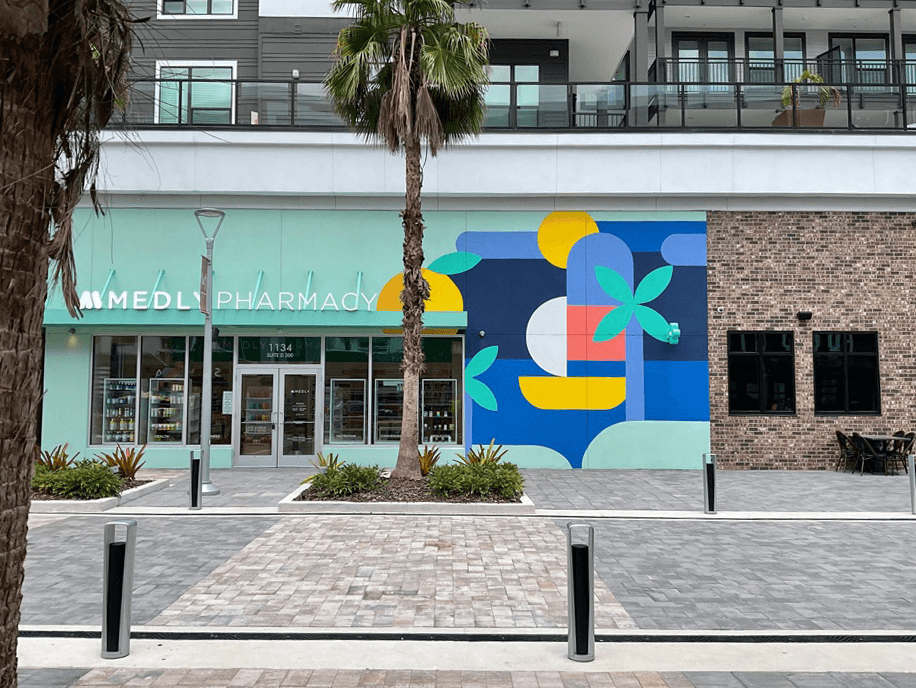
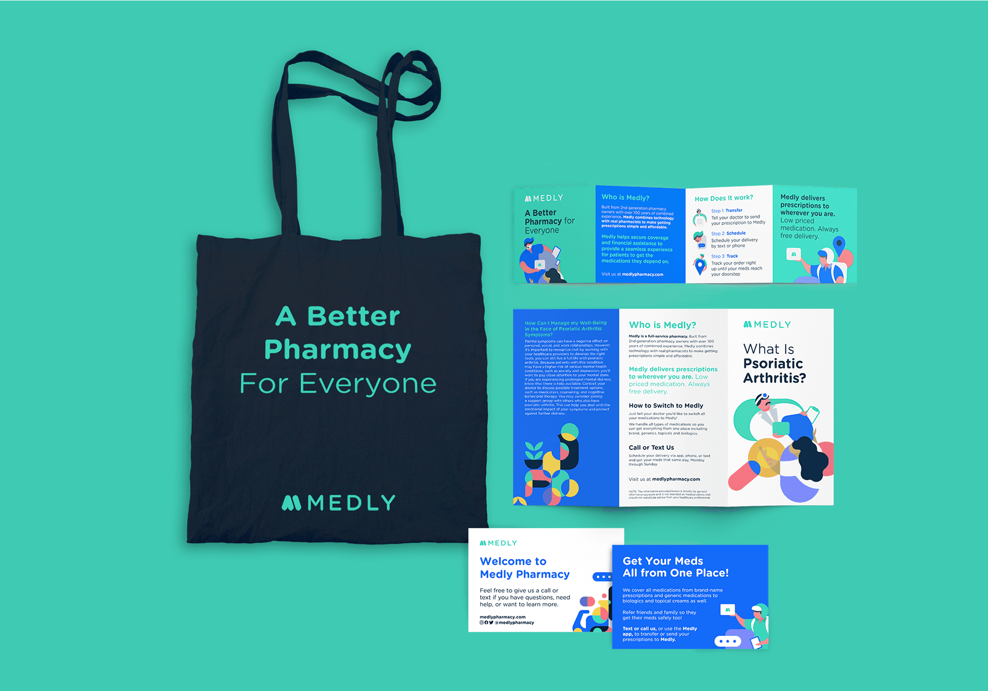
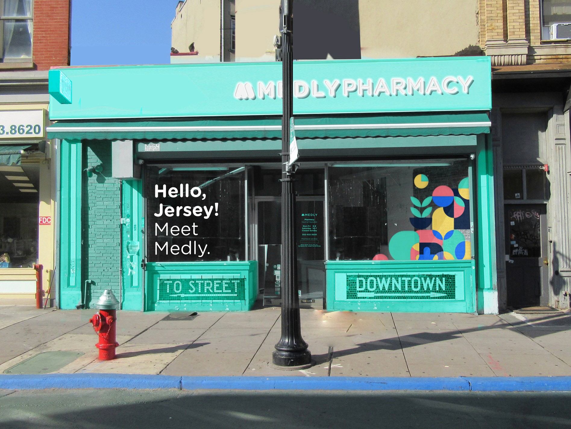
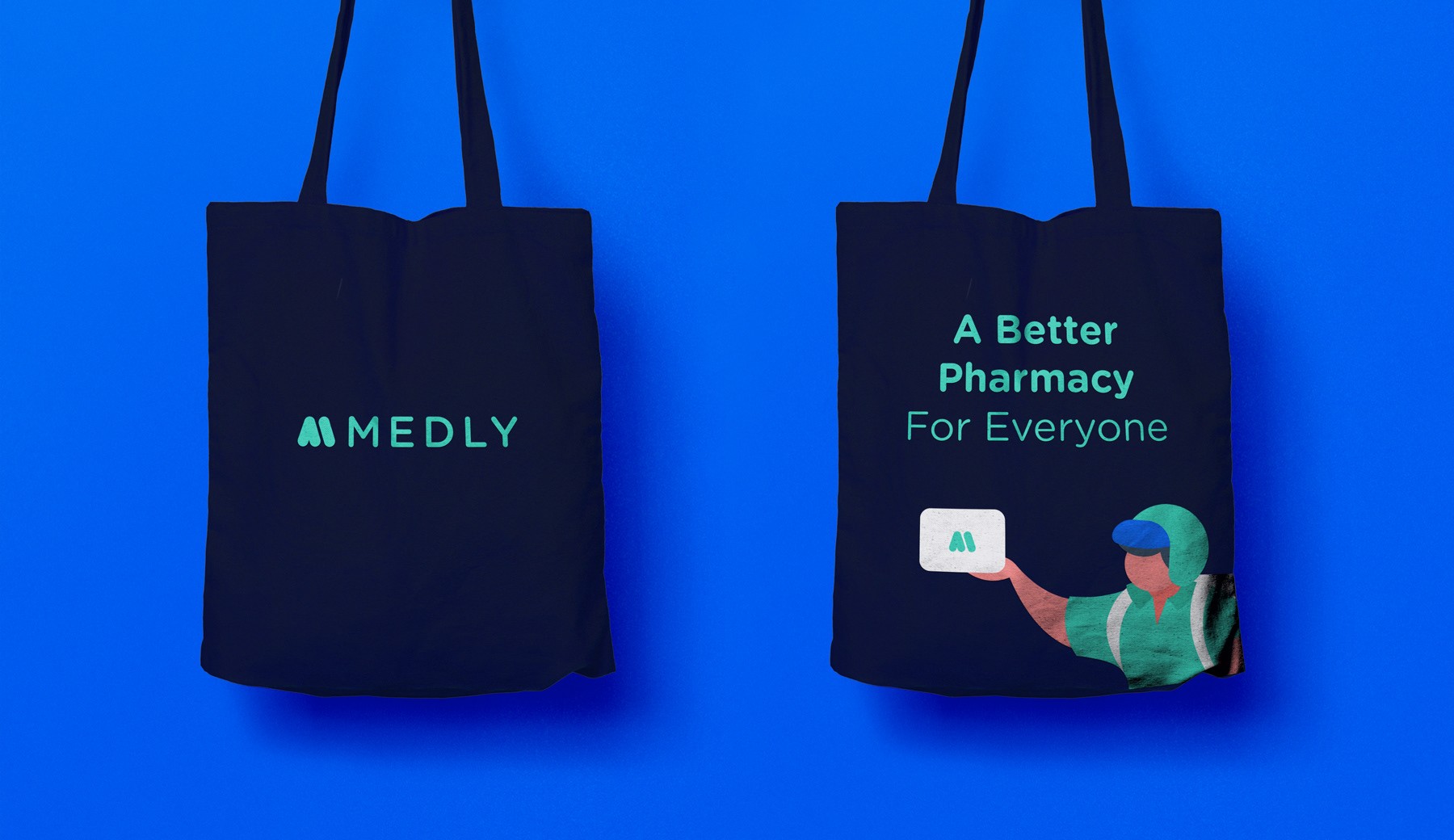
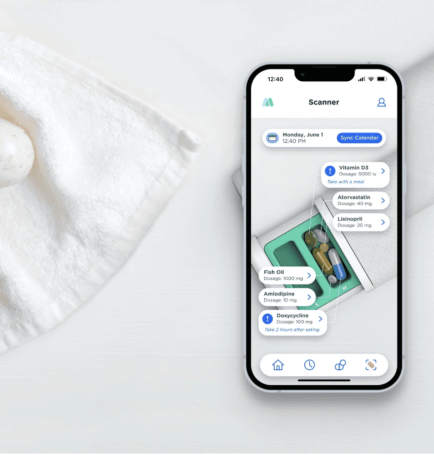
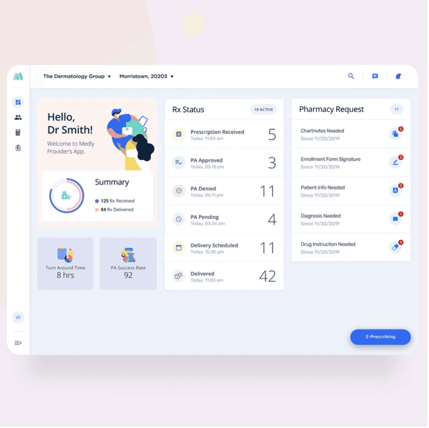
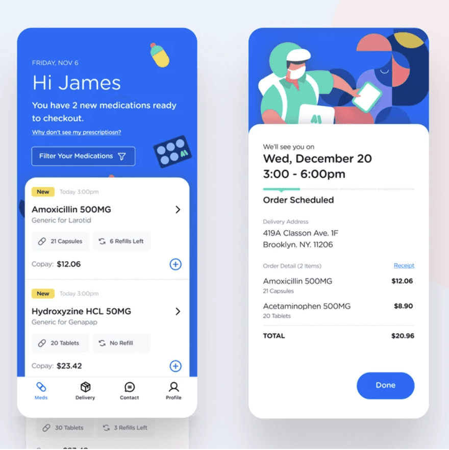
Building a brand experience is about building trust. Working closely with the Design Director, I distilled the brand values and attributes into icon, illustration, pattern libraries that encompass Medly's core service areas, Medly's Specialty Pharmacy portfolio, the cities where our brick-and-mortar pharmacies operate in, etc. Those design components found their ways into the Medly app, the website, brand collateral, merchandising, retail spaces, among other online and offline touch points. It's clear to see a strong central identity running through the brand, and it became a catalyst for the company to rally behind.

The Pattern Grid, An Atomic Design System
At the beginning of the rebrand, the web design agency came up with an abstract geometric pattern that was the 1.0 version of the pattern below. Together with the Design Director, we distilled the pattern into a grid that includes the simple yet sophisticated range of geometric shapes that we call "atoms", which make up our illustrative patterns.
This grid was the starting point of endless possibilities, in which it resembles the LEGO design system -- the shapes are different bricks and the grid makes sure all bricks, despite their differences in shape and form, fit firmly together.

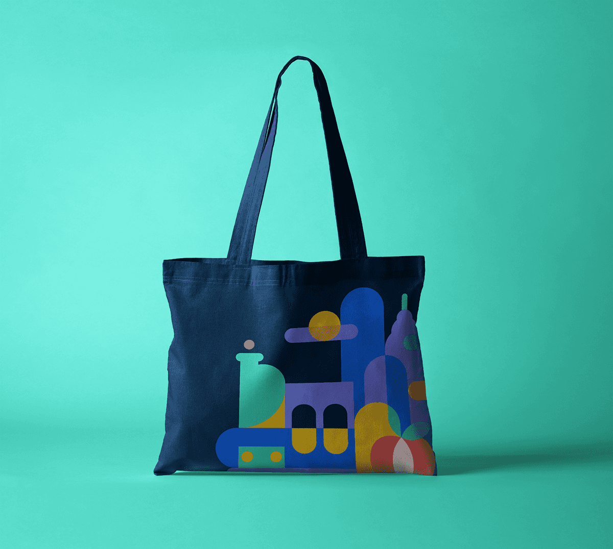
Below you can find pattern-based illustrations I designed following the grid design system.

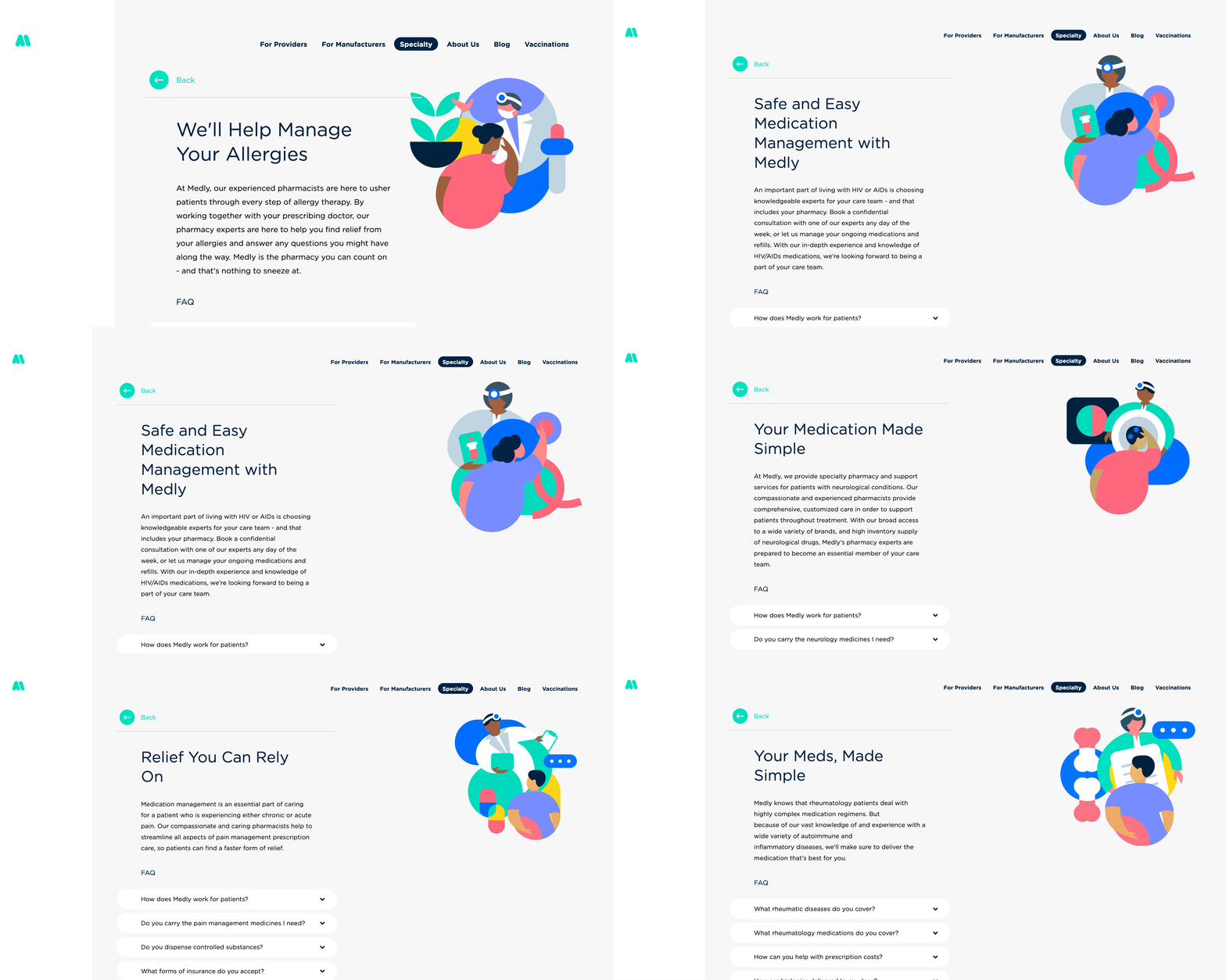
I also developed the pattern-based illustration library for Medly's entire Specialty Pharmacy portfolio, which was later leveraged in a variety of digital and print mediums.
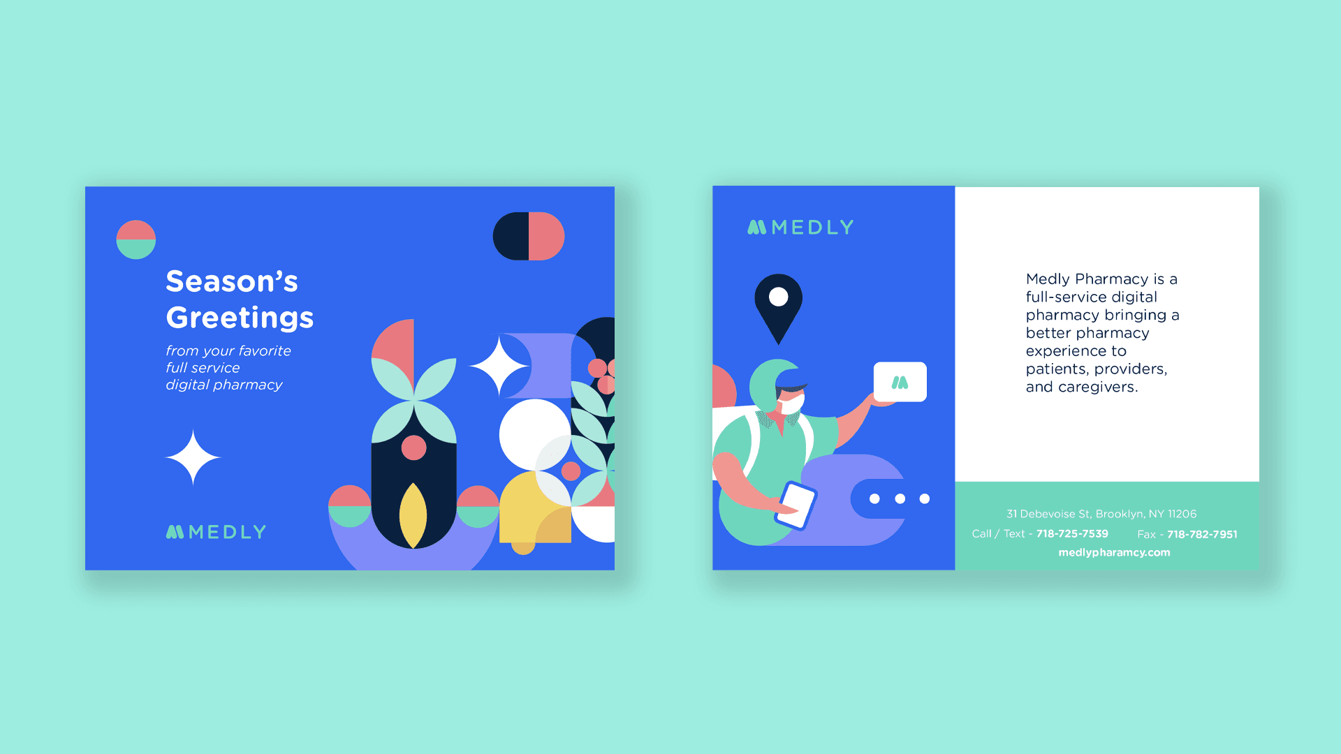
Below are just a few other pieces I had fun creating at Medly. I'm grateful for my time on this talented team, which allowed me to hone my skills, develop an aptitude for systems, and contribute to strategies that played an important role in delivering a consistent and complete customer experience.


